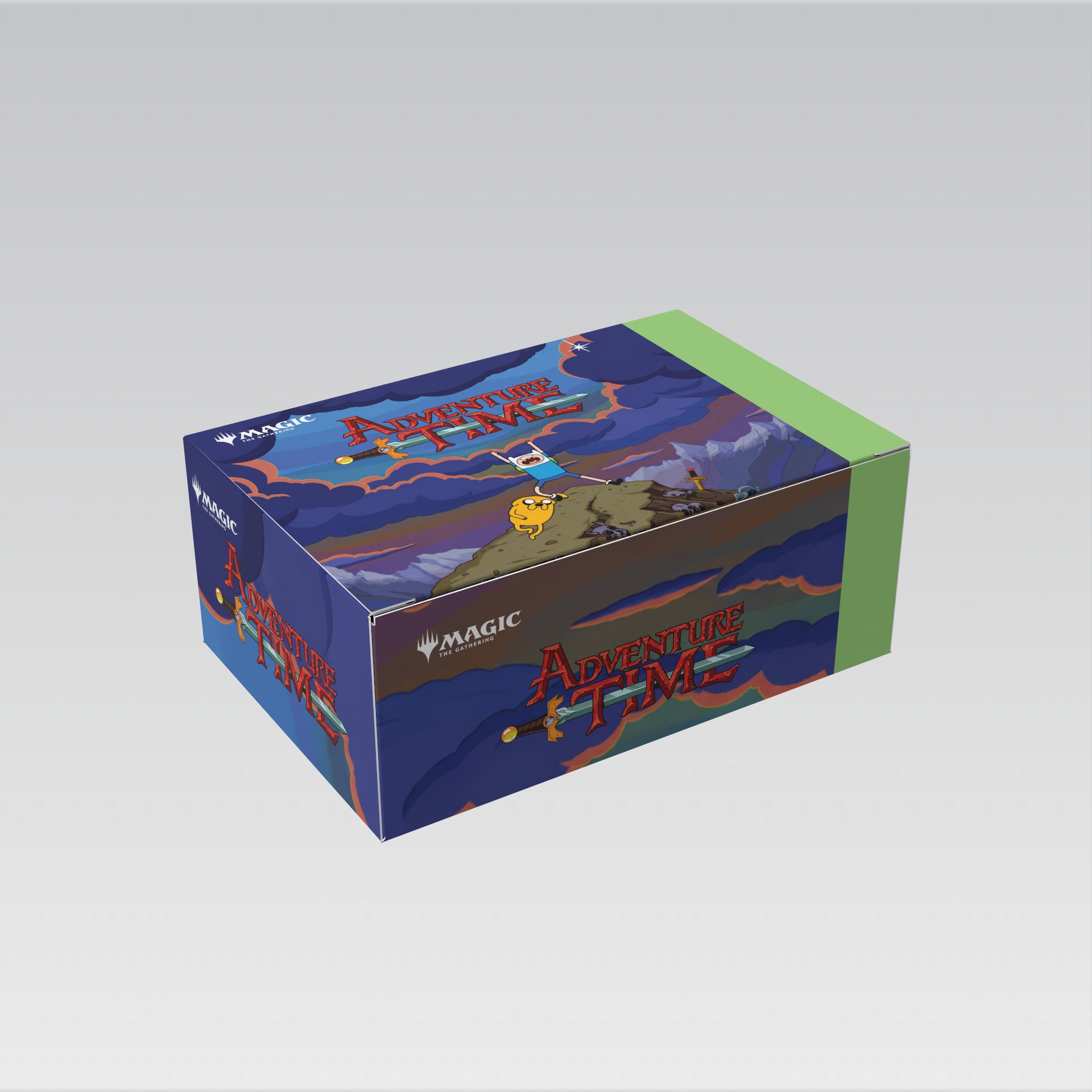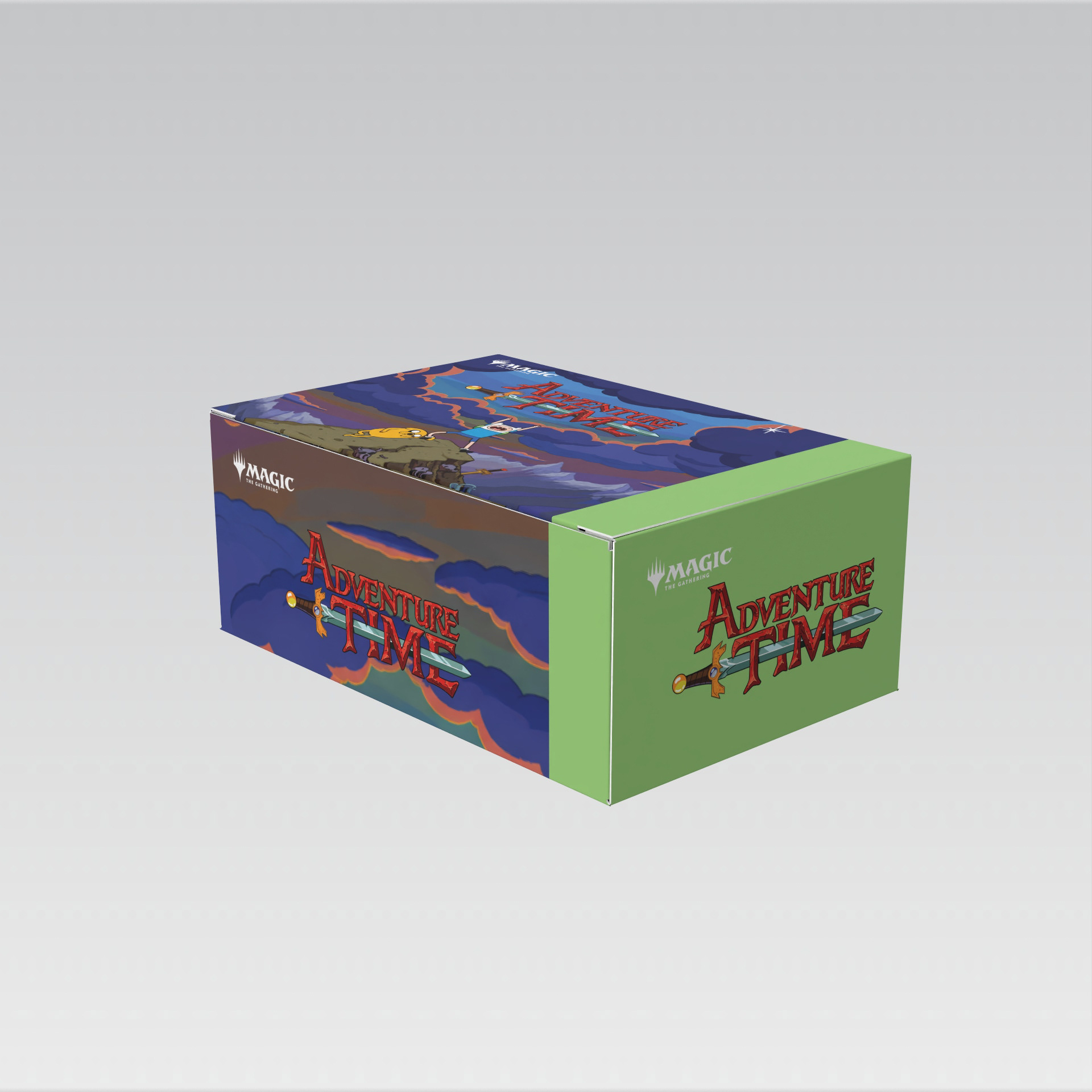
Magic: The Gathering × Adventure Time — Packaging Fictional Concept
A fictional packaging concept exploring a potential collaboration between Magic: The Gathering and Adventure Time.
I developed the concept as a personal exploration of how two distinct visual worlds could come together while still feeling cohesive and recognizable. The design combines the playful, colorful visual language of Adventure Time with the established packaging aesthetic of Magic: The Gathering.
Concept + Design
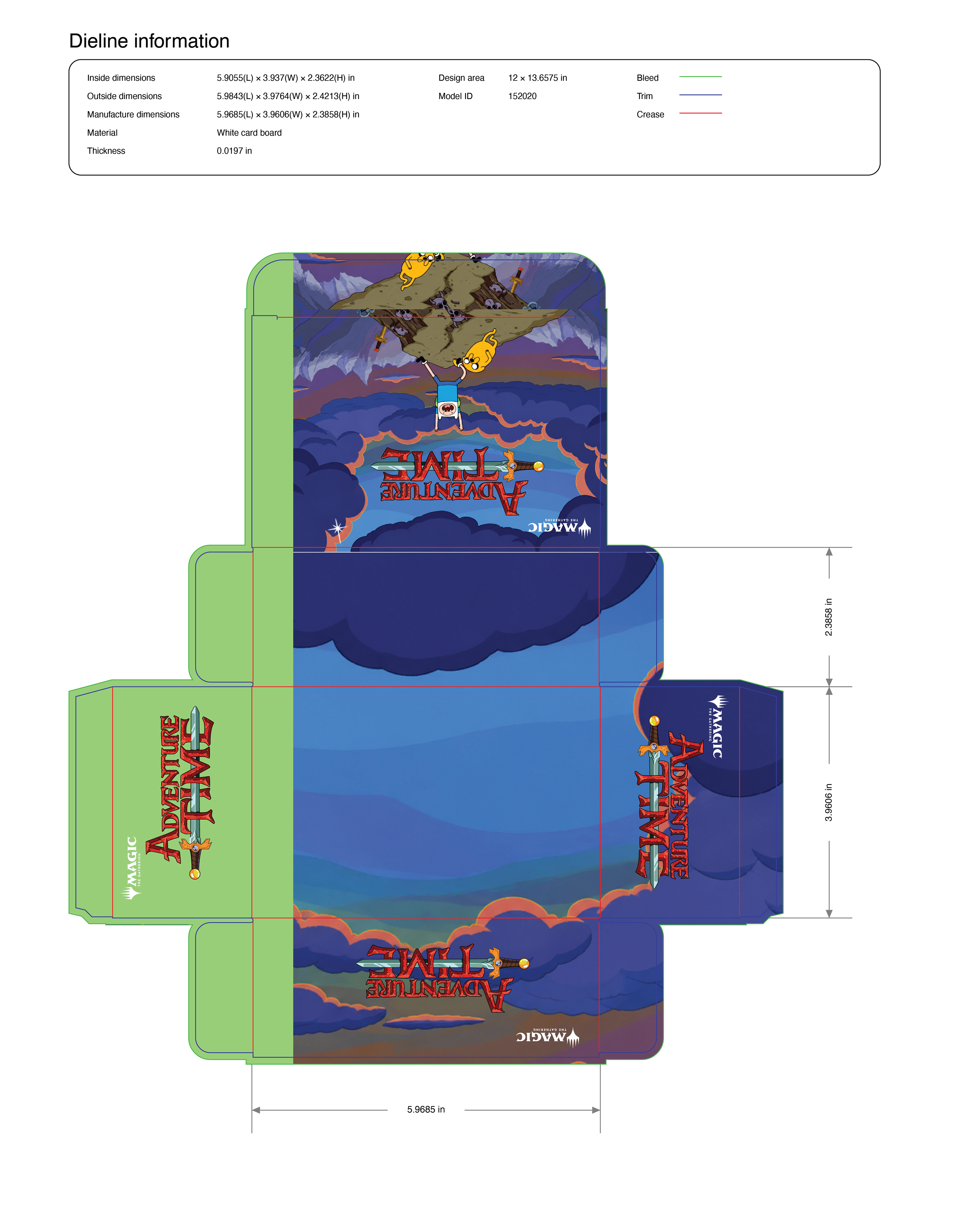
The goal was to imagine what a collaborative Magic product could look like as a retail-ready physical package, from the overall visual direction through the structural application of the artwork.
I developed the packaging artwork to wrap across multiple panels of the box, considering how the illustration, branding, title treatment, and supporting graphics would transition across the physical structure.
Key areas included:
Packaging concept development
Structural packaging design
Multi-panel artwork adaptation
Typography and hierarchy
Character/illustration integration
Brand integration
Retail-focused visual design
3D packaging visualization
Design Approach
The concept explores how to balance two established brands without allowing one visual identity to overpower the other. I used the Adventure Time artwork and character-driven aesthetic as the primary visual storytelling element while incorporating Magic: The Gathering branding and packaging conventions to make the concept feel like a believable licensed product.
What This Demonstrates
Creative Concepting — Developing an original product concept from an initial idea.
Packaging Design — Designing artwork across a physical package and considering how graphics interact across panels.
Brand Integration — Combining established visual identities into one cohesive system.
Typography + Layout — Creating hierarchy that works across multiple surfaces.
Production Thinking — Considering the physical structure, panel transitions, and final presentation of the package.
Back to Top